留下 Email
成為類聚之友
成為類聚之友
不定期取得類聚第一手資訊!課程、活動與免費資源!

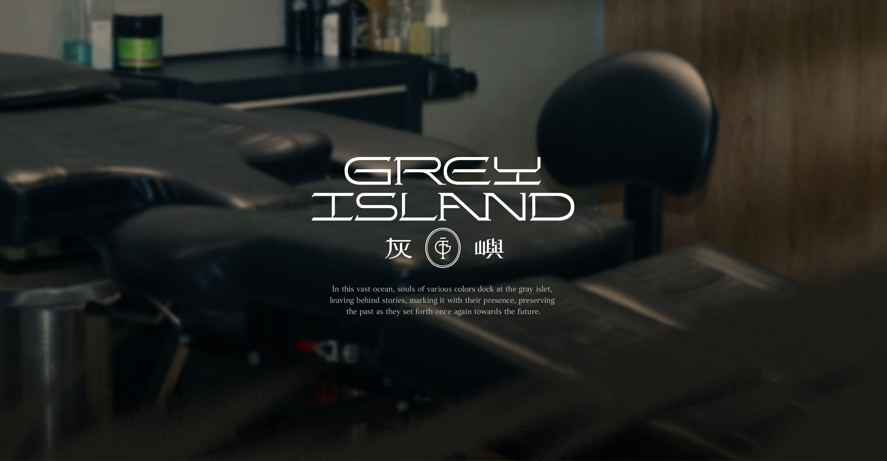
刺青,不只是圖案,更是生命的印記。
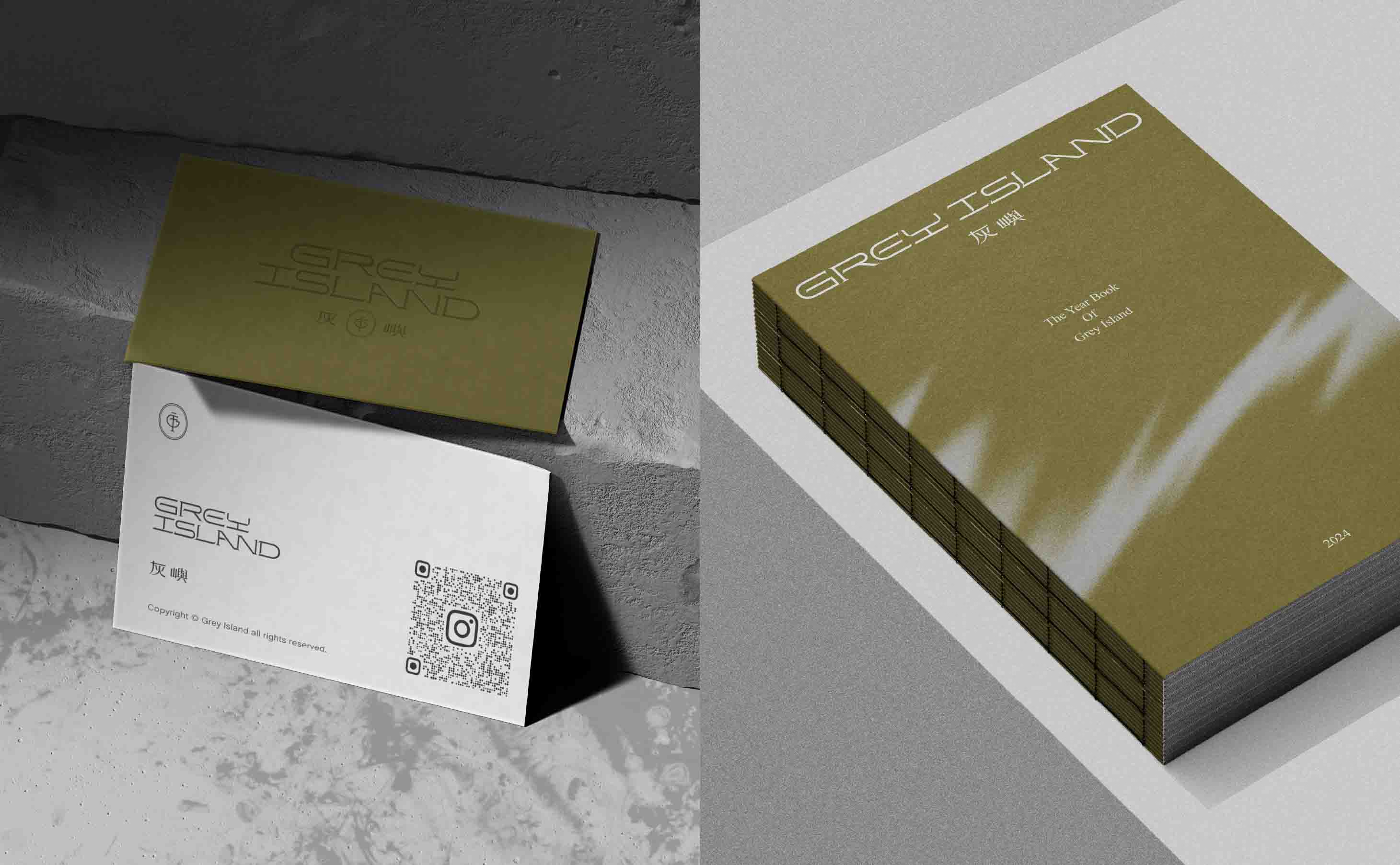
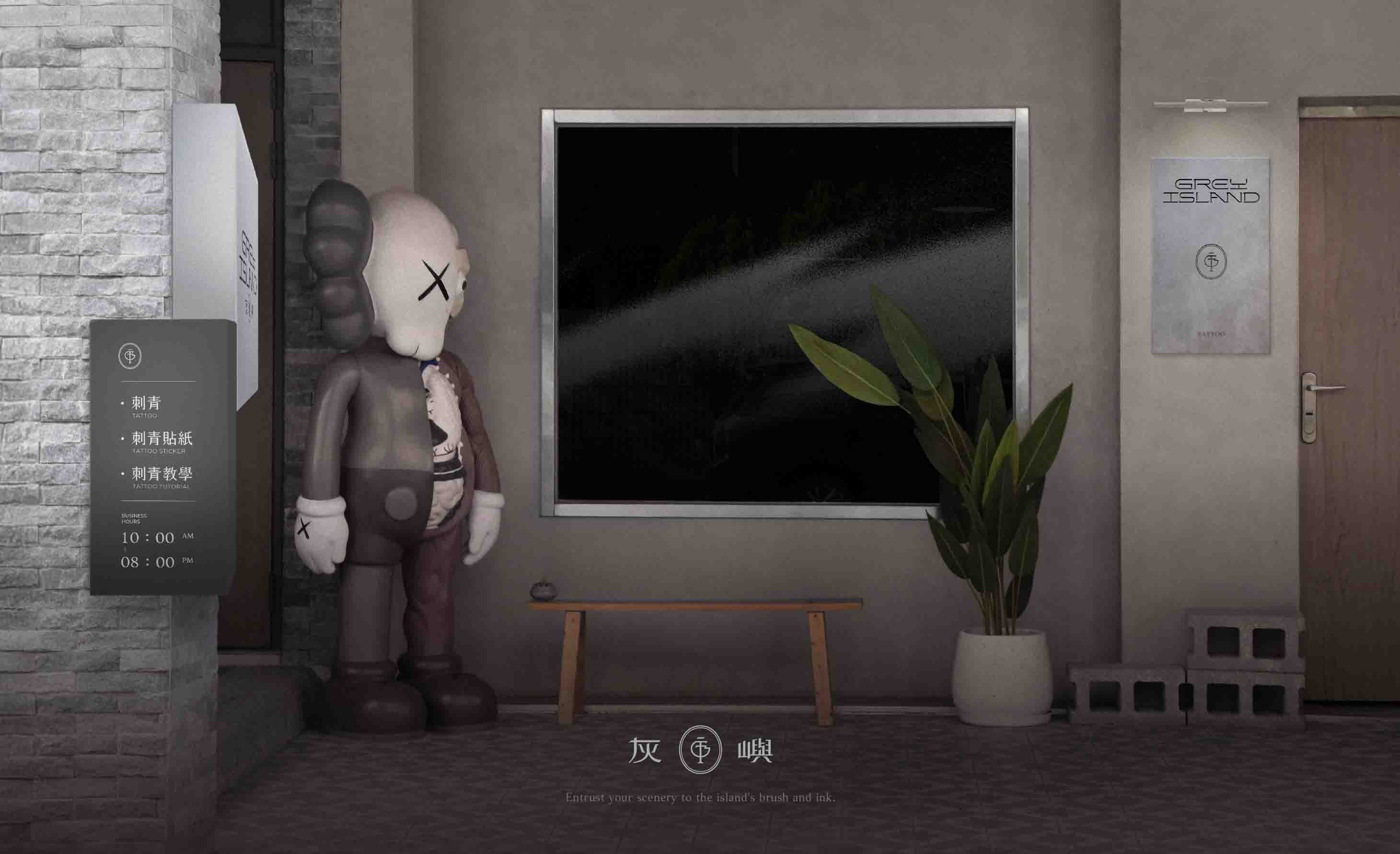
來自台中的 灰嶼刺青,前身是頗具名氣的三樓刺青,如今以全新品牌形象出發,集結更多優秀刺青師,打造一座承載藝術與故事的「島」。類聚團隊這次不只協助品牌識別重塑,更深度參與品牌發展規劃,為灰嶼構築完整的視覺語言,讓品牌不只是風格,而是文化的延續。
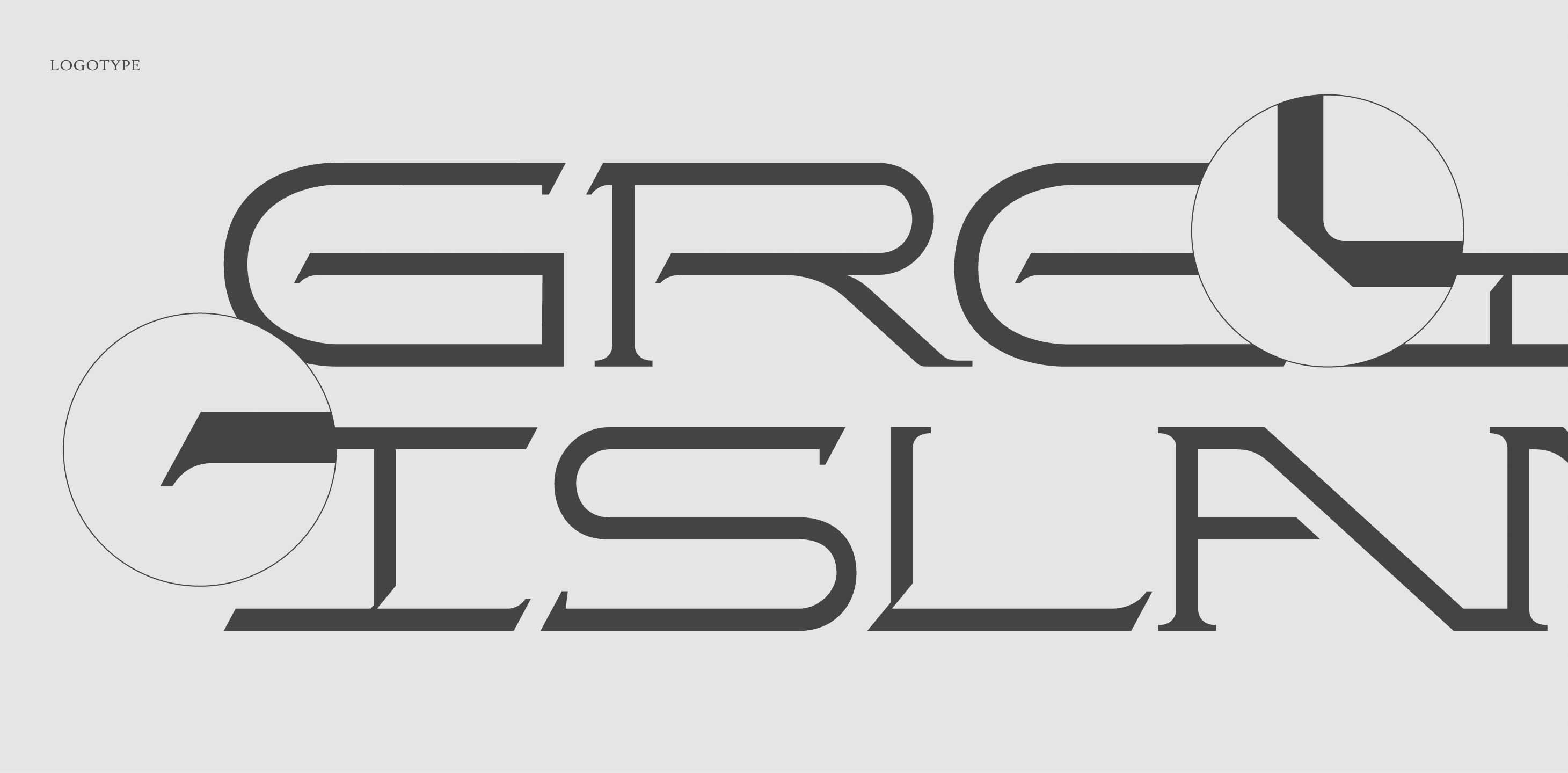
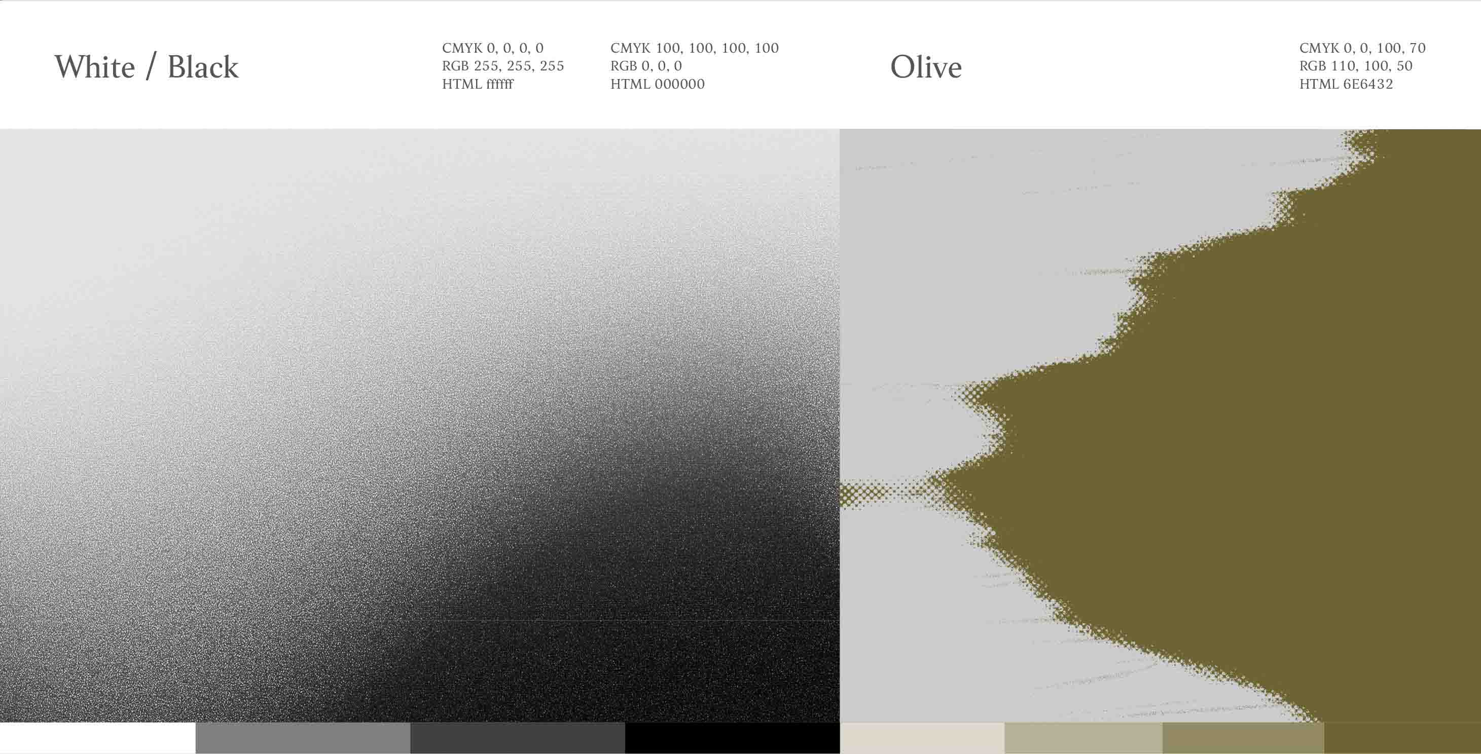
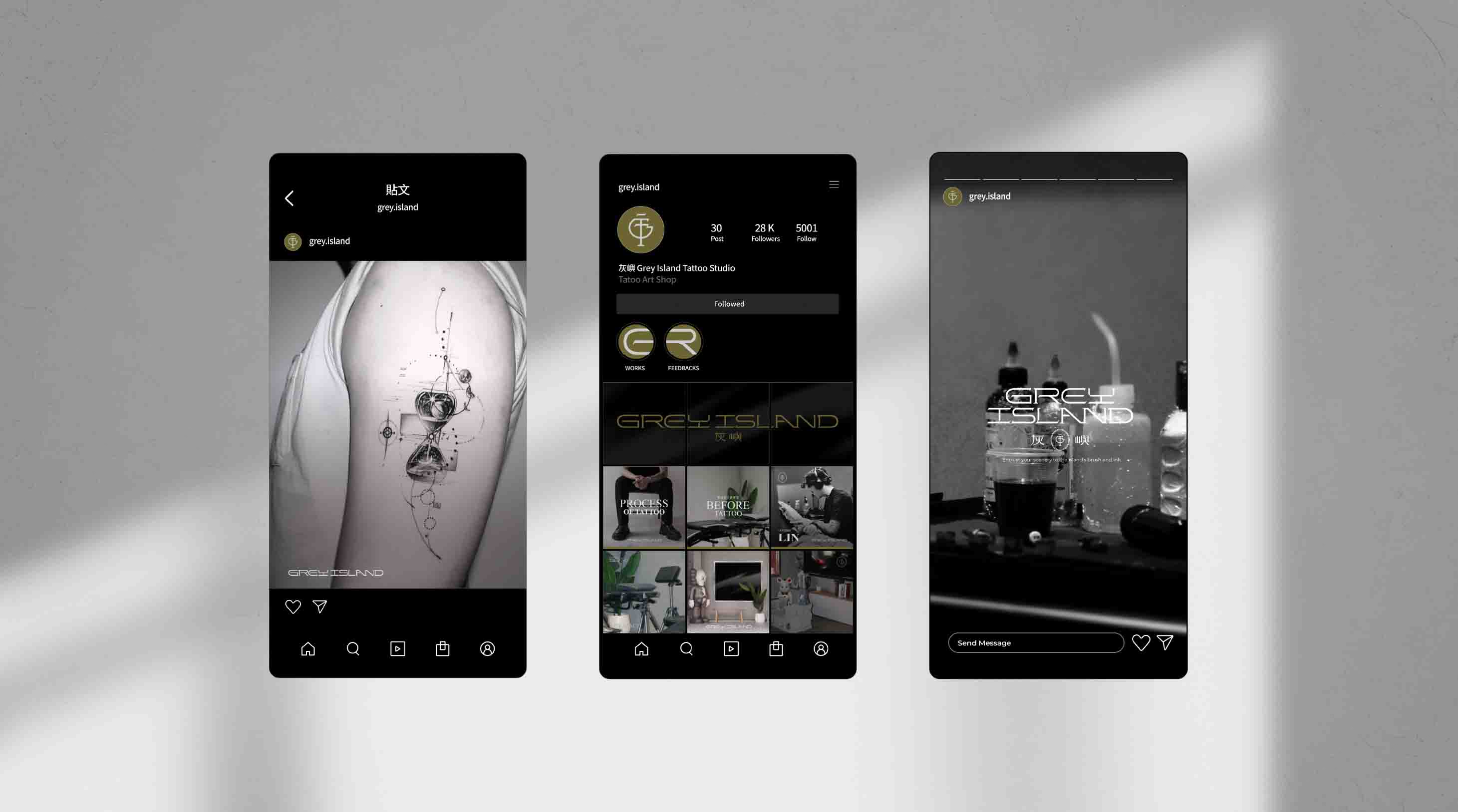
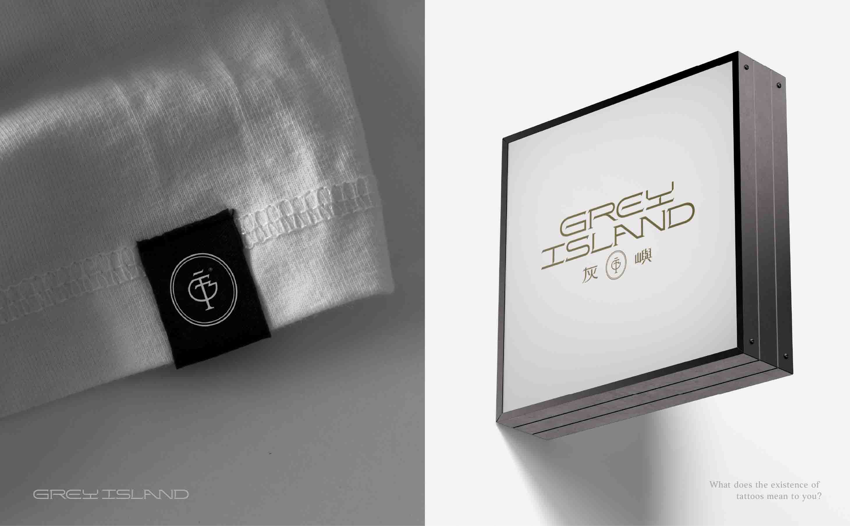
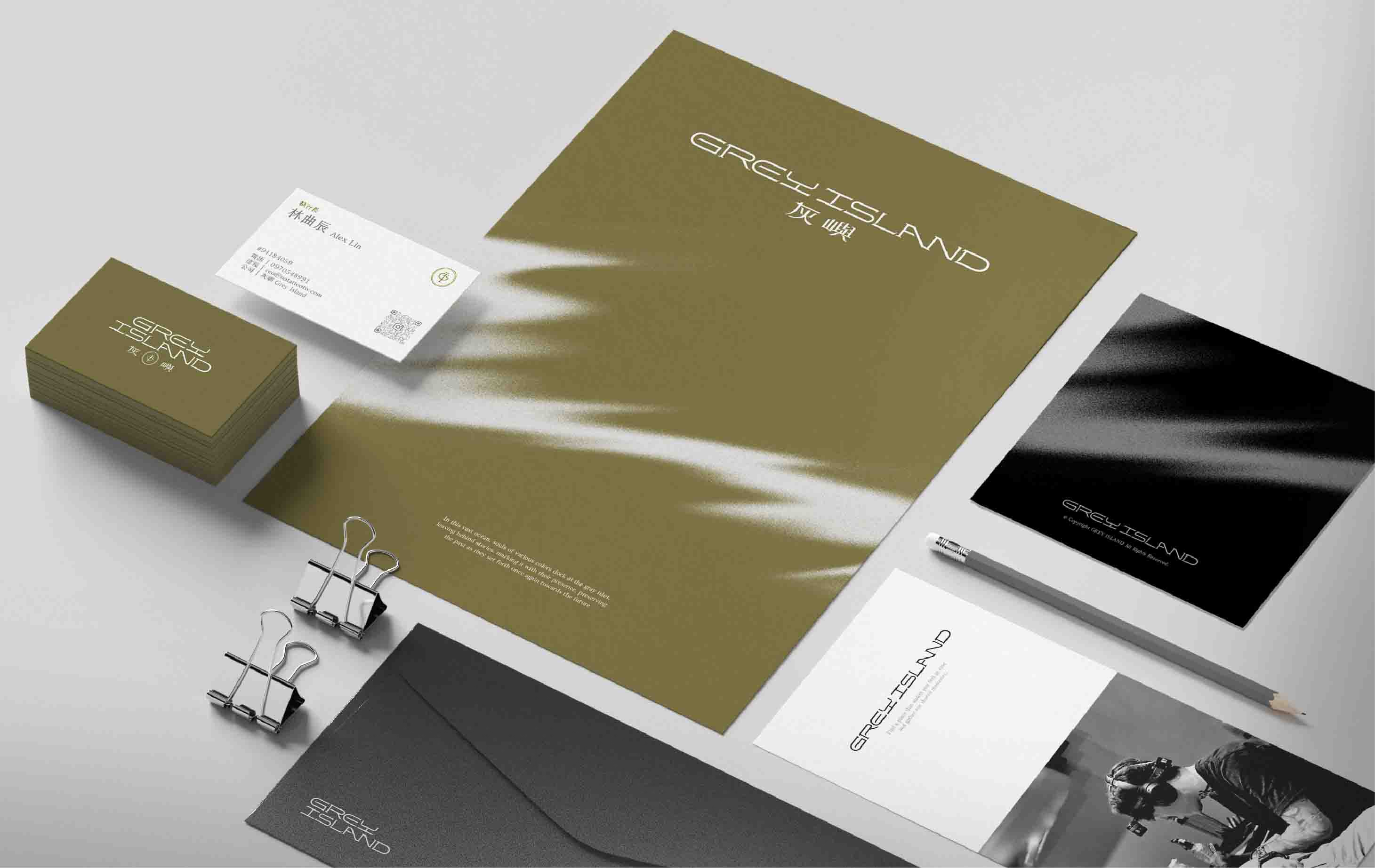
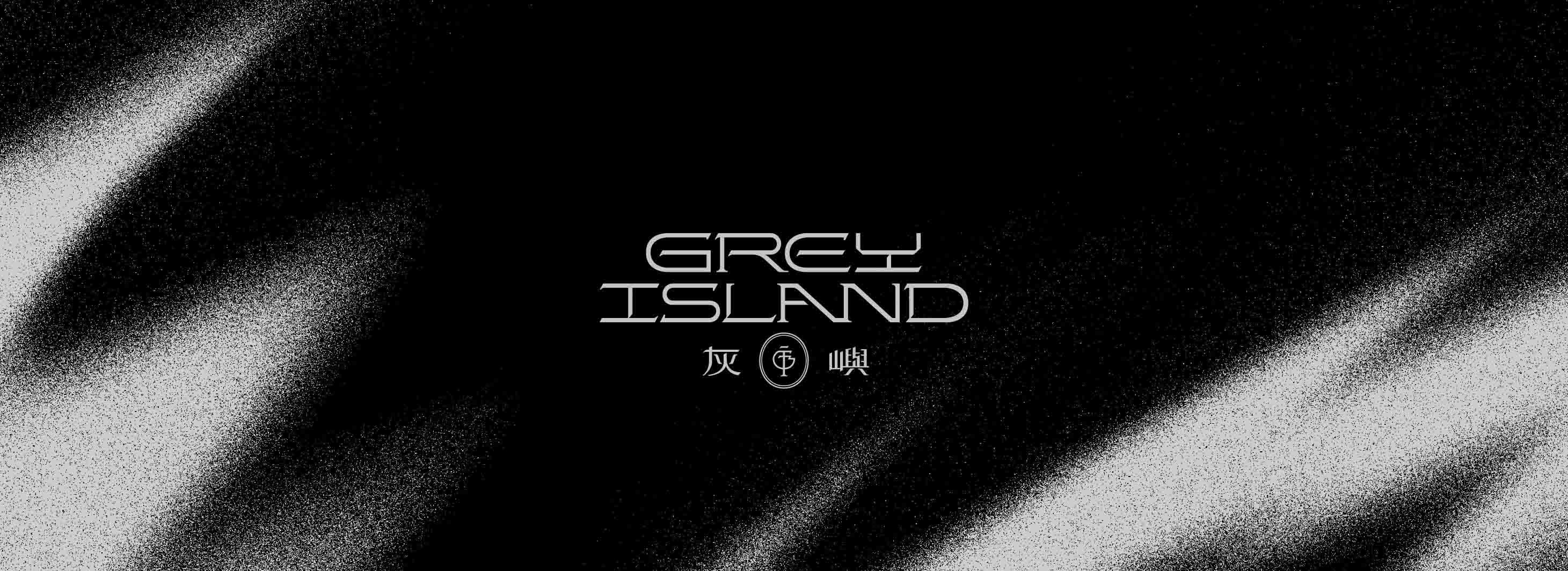
我們將 「GI」與「3F」 巧妙結合於標誌設計,讓新品牌承載過往的根基,同時迎向未來。配色選擇沉穩的墨綠與水墨灰,呼應肌膚上的細膩筆觸,也象徵刺青與大地的連結;標準字體風格融合古典與現代,塑造出優雅且具個性的品牌形象。此外,類聚團隊更設計了一套 易於應用的社群模板與簡報系統,確保品牌識別的延展性,讓每一筆紋身都像是一篇故事,細細刻畫於肌膚之上。
在這座 「灰色島嶼」 上,小林師傅與夥伴們將繼續用針尖與墨水,描繪出專屬每個人的記憶與靈魂。
A tattoo is more than a design—it’s a mark of life.
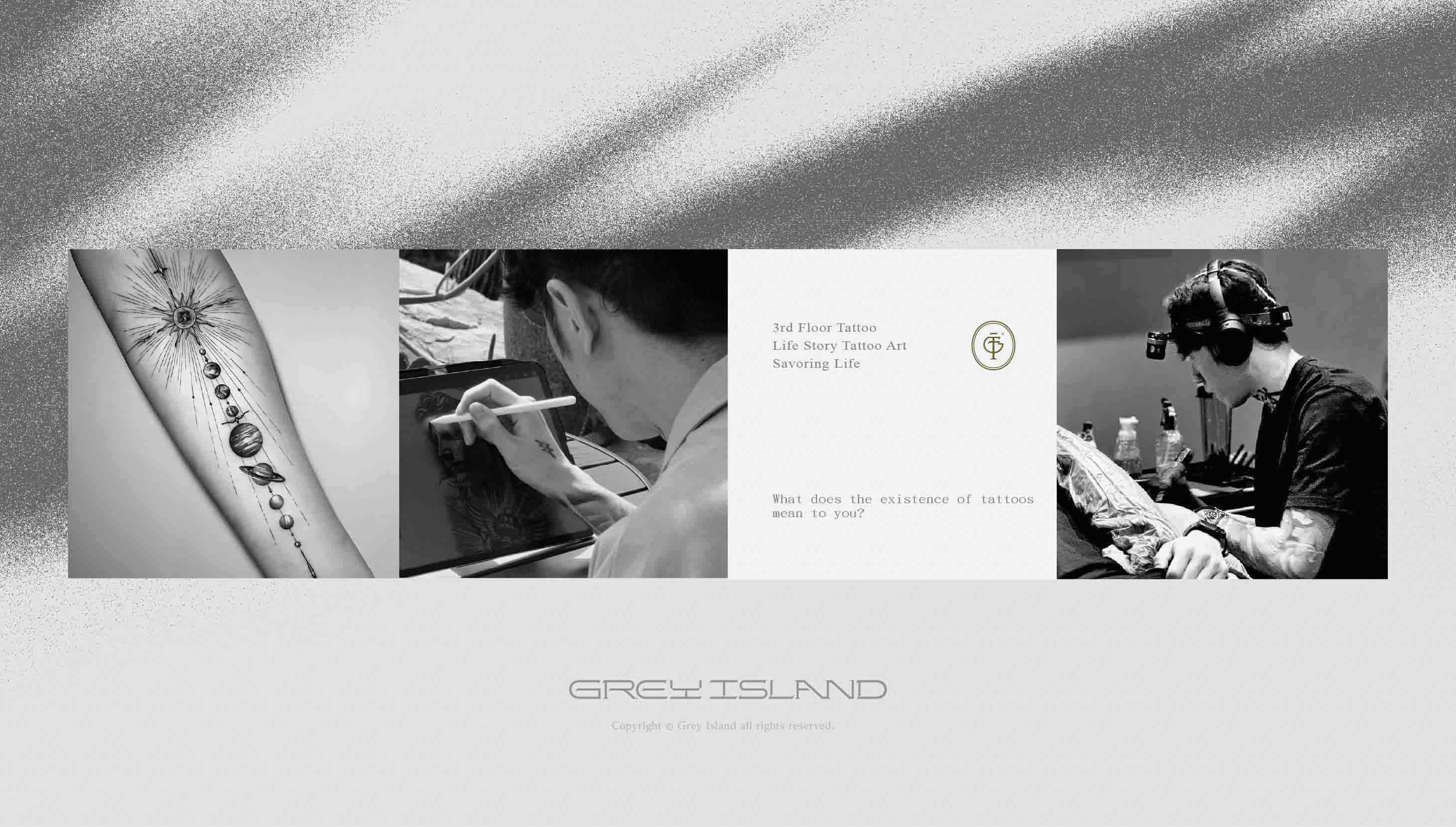
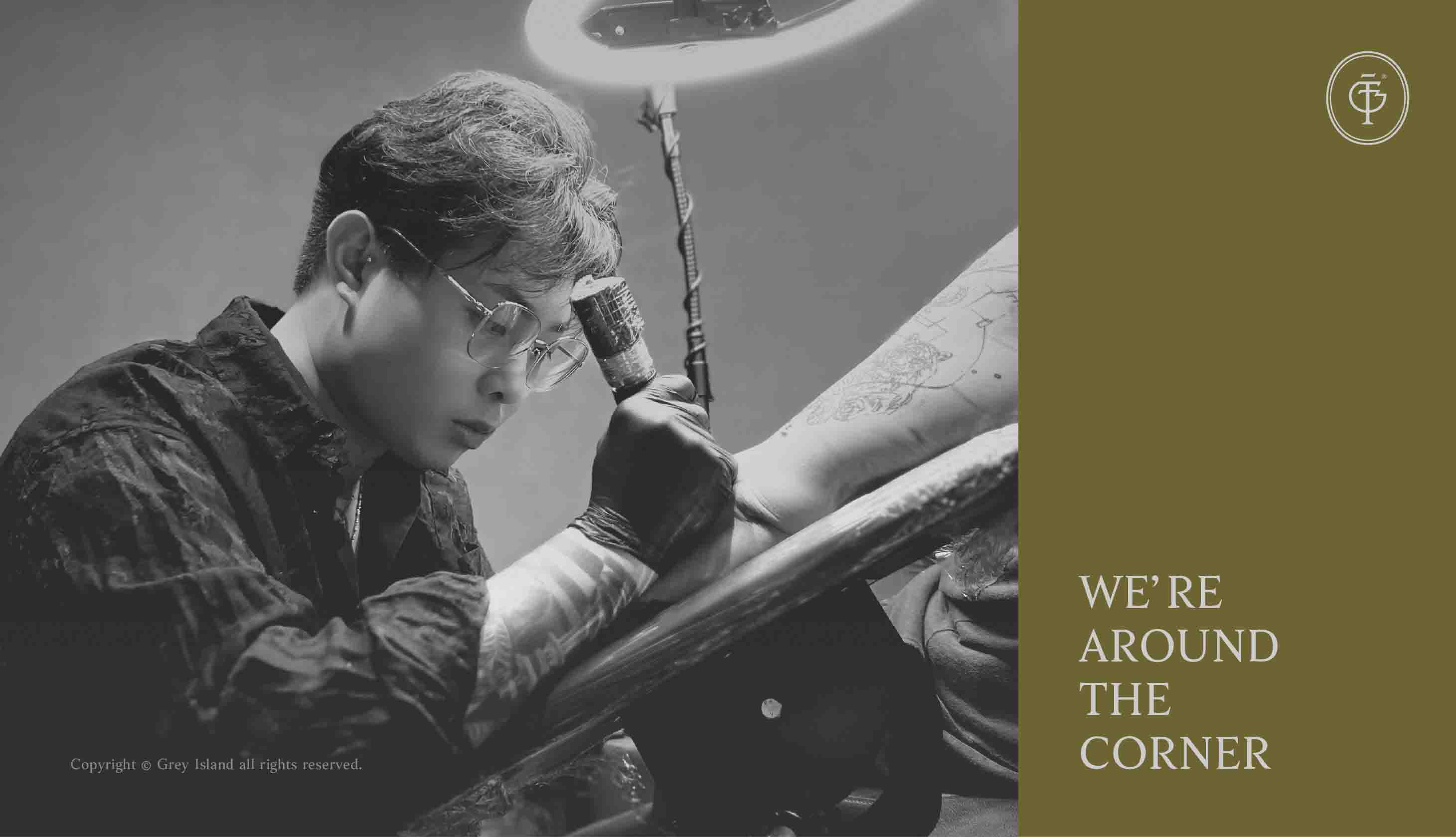
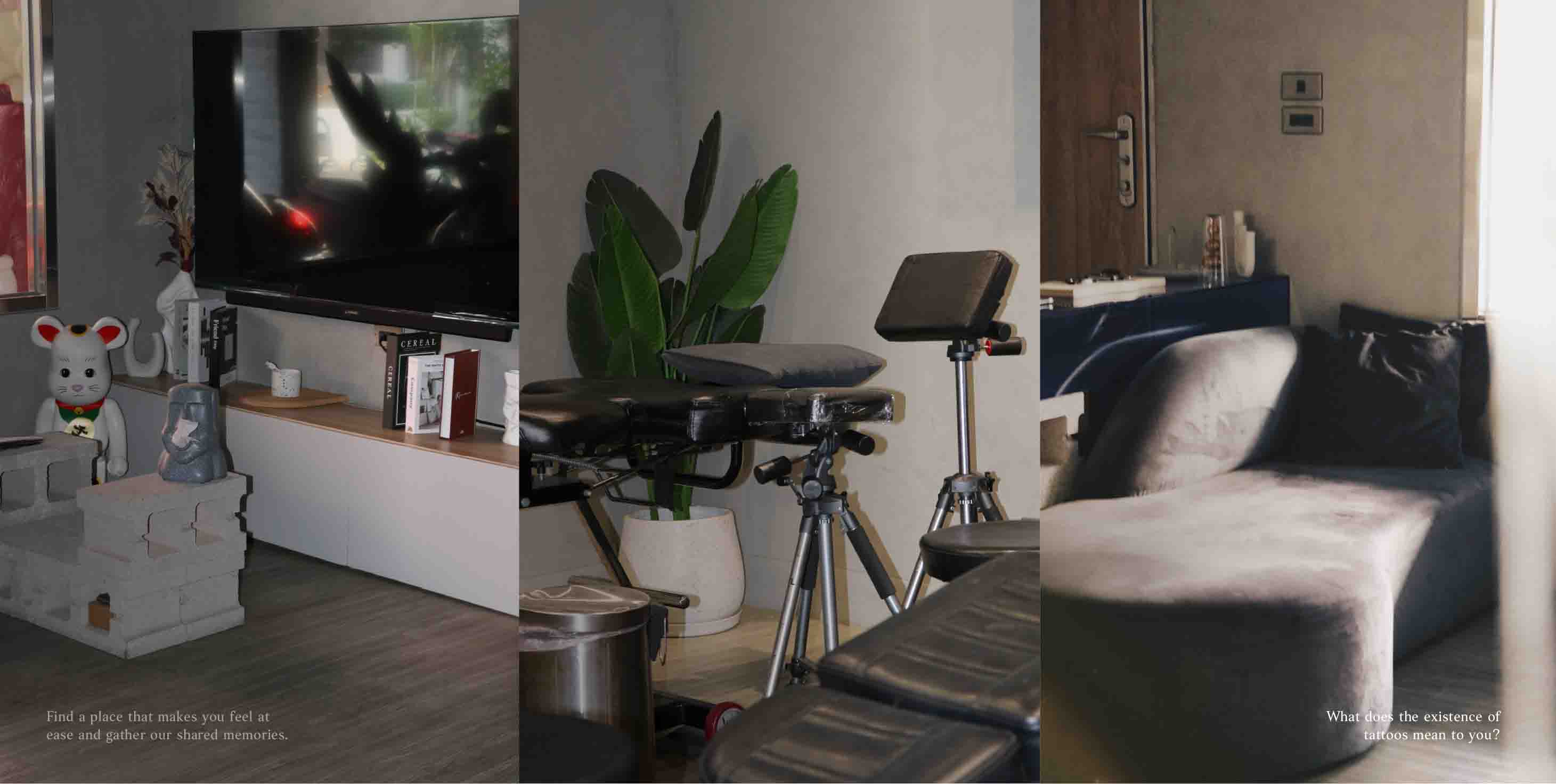
Hailing from Taichung, Grey Island Tattoo is the evolution of the well-known “3rd Floor Tattoo.” Now reimagined with a fresh brand identity, it gathers even more exceptional tattoo artists to create an “island” where art and stories come together.
This time, the Grandvity team didn’t just rework the brand identity—we dove deep into brand development, building a complete visual language for Grey Island. The result is a brand that’s not just about style, but about cultural continuity.
The logo subtly fuses “GI” and “3F,” paying homage to the past while embracing the future. The color palette—deep forest green and inky grey—echoes the delicate strokes on skin, symbolizing a connection between tattooing and the earth. The custom logotype blends classical and contemporary elements, crafting a brand image that feels both elegant and bold.
Beyond identity design, we also created a versatile set of social media templates and presentation tools to ensure the brand system is as fluid and expressive as each tattoo. On this “grey island,” master Lin and his team continue to etch memories and souls—one needle, one story at a time.


Client | GREY ISLAND 灰嶼刺青
Production | 物以類聚視覺整合 Grandvity Design
Creative Director | Noodle Wang
Administrative Director | Grape Chiu
Project Director | Sarah Peng
Design Director | Si Jia Sun
Project Manager | Zoe Liu
Logotype Designer | Noodle Wang / Hugo Tseng
Visual System Designer | Hugo Tseng
Visual Designer | Hugo Tseng / Ricky Lee
Portfolio Designer | KC Hsu